
The About Us Banner component is used to create the banner on the About Us page.

The Alerts & Notification component is used to deliver infrequent but important information to DPSS Customers. They appear at the top of the pages and are meant to disrupt the natural flow of the site.

The Button component is used to add buttons to a page or to the card component.

The Card Component is used to display information to the customer. It has a predefined format for displaying a title, an image, a description and buttons.

Content Fragments are re-usable pieces of text or images. The content fragment is used to create the text in the global footer.

The Error Page component is used to create the various error pages.

The Events Around The Community component is used to add events to a page. The component is automatically populated with the four most recent events.

The Feedback component asks customers “Did you find what you are looking for?” and provides them an opportunity to give feedback on their experience.

The Homepage Callout is used to add text and images to the homepage.

The Homepage Banner is used to create the area at the top of the homepage and should not be used elsewhere on the site.

The How To Apply Card component shows how to apply for each program and service. It is a part of Program Page template and is on all program and service pages.

The Language Navigation component is used to configure the language selector in the global navigation and should not be added to any pages.

The Quick Search component is used to create the search bar in the navigation and it should not be added to pages.

The Social Sharing component is used to share events and news articles. It should be added to all event pages and all news article page.

The Text component is used to add text to a page. The Text component is also used to create data tables.

The All Programs & Services component is used to create the All Programs & Services Page. It is an automatically generated list of all the current programs and services in alphabetical order.

The Breadcrumb component is used to add navigation links to the top of the pages.

The Calendar component is used to add the Events Calendar to a page.

The Carousel component is used to create image galleries.
The Content Page Banner is used to create the banners at the top of the pages.
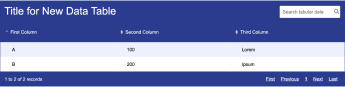
A Data Table can be added to the page using a Text component.

Experience fragments are used to create groups of re-usable components. The Experience Fragment is used to create the page headers.

The Event Detail component is used to create an Events page.

The global page footer.

The Frequently Asked Questions component is used to create an accordion of questions, where customers can expand each question to see the answers.

The Form Container component is used to add a form to the page.

The Homepage Newsfeed component is used to add news items to the homepage. It is automatically populated with the 4 most recent news articles. The thumbnail image and the title are taken from the News Page Template page properties.

The Image component is used to add an image to the page.
The News Archive component is used to create the News Archive page. It is automatically populated with content from articles made using the News Article template.

The Section Container component is used to group other components together. It can also be used to place background colors or images behind other components.

The Teaser component is used to add text over an image. This component is usually used inside the Carousel component.

The Video component is used to add a video to a page.